Now that the data has been down sampled and filtered it is clean enough to visually inspect. This takes some training but isn’t hard to learn. In the first instance, we are looking for electrodes that display unusual variance. Sometimes this can be obvious, and sometimes a little more subtle. To do this we want to carefully skim through the data by moving through time and looking at all the electrodes. We can play with the settings after we’ve plotted the continuous data to change the scale on the x and y axes to be able to view the data quickly.
Spotting these ‘noisy’ or ‘bad’ electrodes takes practice and you’ll improve with time. To be identified as ‘bad’ electrodes need to meet a few criteria:
- Their voltage is visibly different and, usually, greater than their neighbours.
- This deviation shouldn’t be temporary but affect large and ongoing sections of the data.
- The electrode should be visibly noisy where ‘events’ have been marked.
Once identified, we want to remove these electrodes from any further analysis, to do so we don’t want to delete them completely but interpolate the data at that electrode on the basis of data from other surrounding electrodes and its location on the scalp. This allows us to continue to use the electrode in later calculations, but you cannot do this to an electrode whose data you wish to statistically analyse. If, when looking at the data, you aren’t sure about which electrode is bad - speak to an instructor in class. In this particular dataset - most of the files don’t have any identifiable ‘bad’ electrodes, so don’t worry if you can’t spot any.
How
Identification of bad electrodes
There aren’t many bad electrodes in the data from the participants that we’ve given you, the specific example we are using comes from Participant 24 - you may not yet be able to see any bad electrodes in the specific file you are looking at.
Initial plotting of the continuous data does indeed show unusual fluctuations in voltage, greater than neighbouring electrodes that seem to continue whilst event markers are visible.
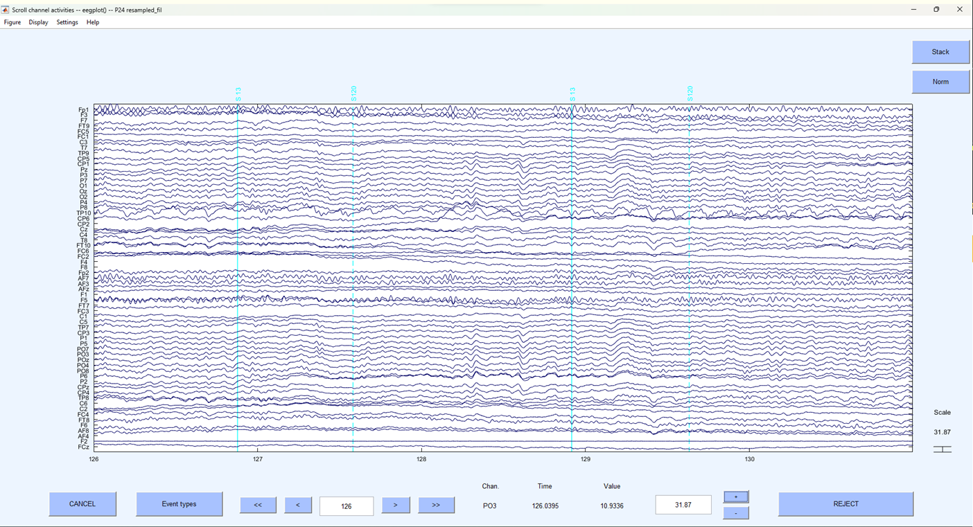
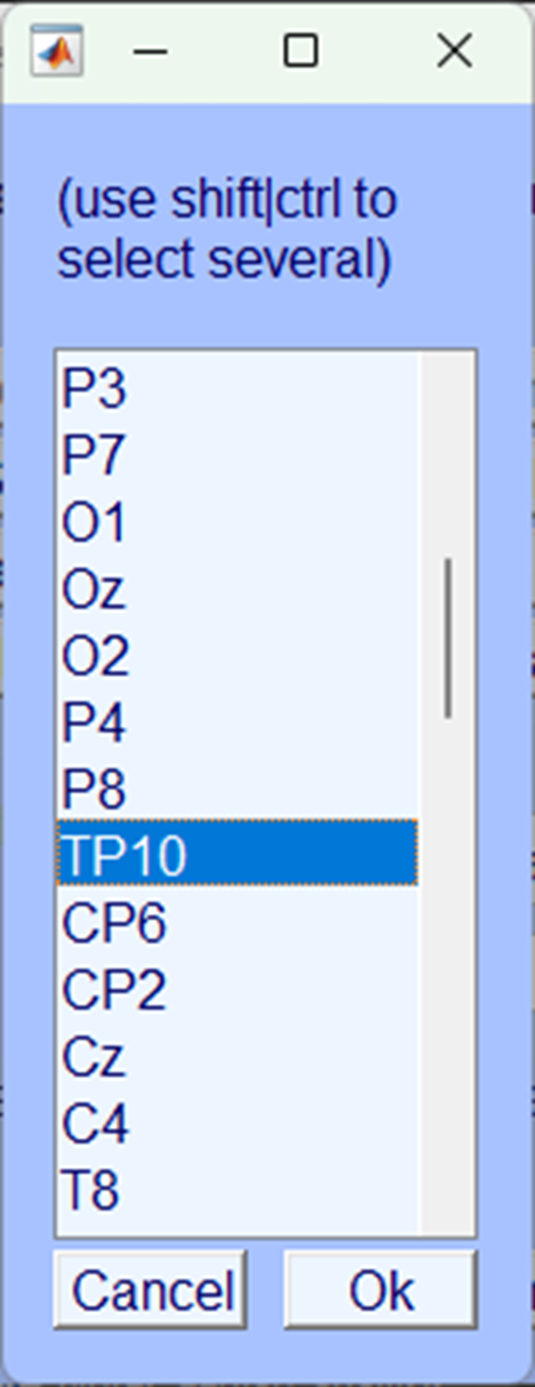
A provisional examination suggests that electrode TP10 is unusual. Let’s examine it a little closer by just displaying that electrode and its closest neighbours.
On the plot window click:
-> Settings
  -> Number of channels to display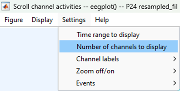
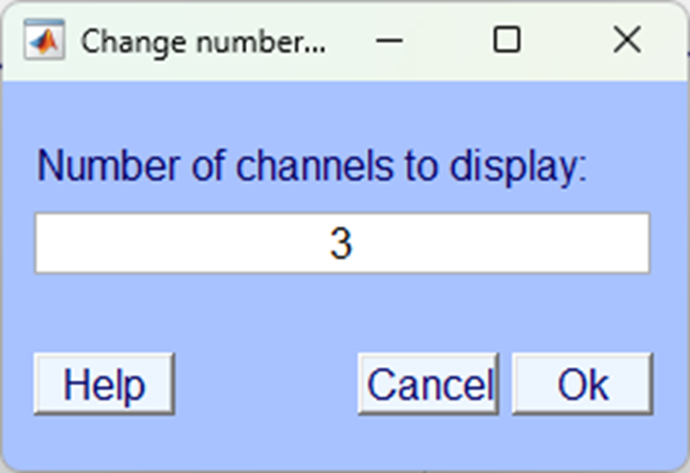
And enter 3 in the pop-up window.
Then scroll along the horizontal scroll bar until electrode TP10is displayed centrally.
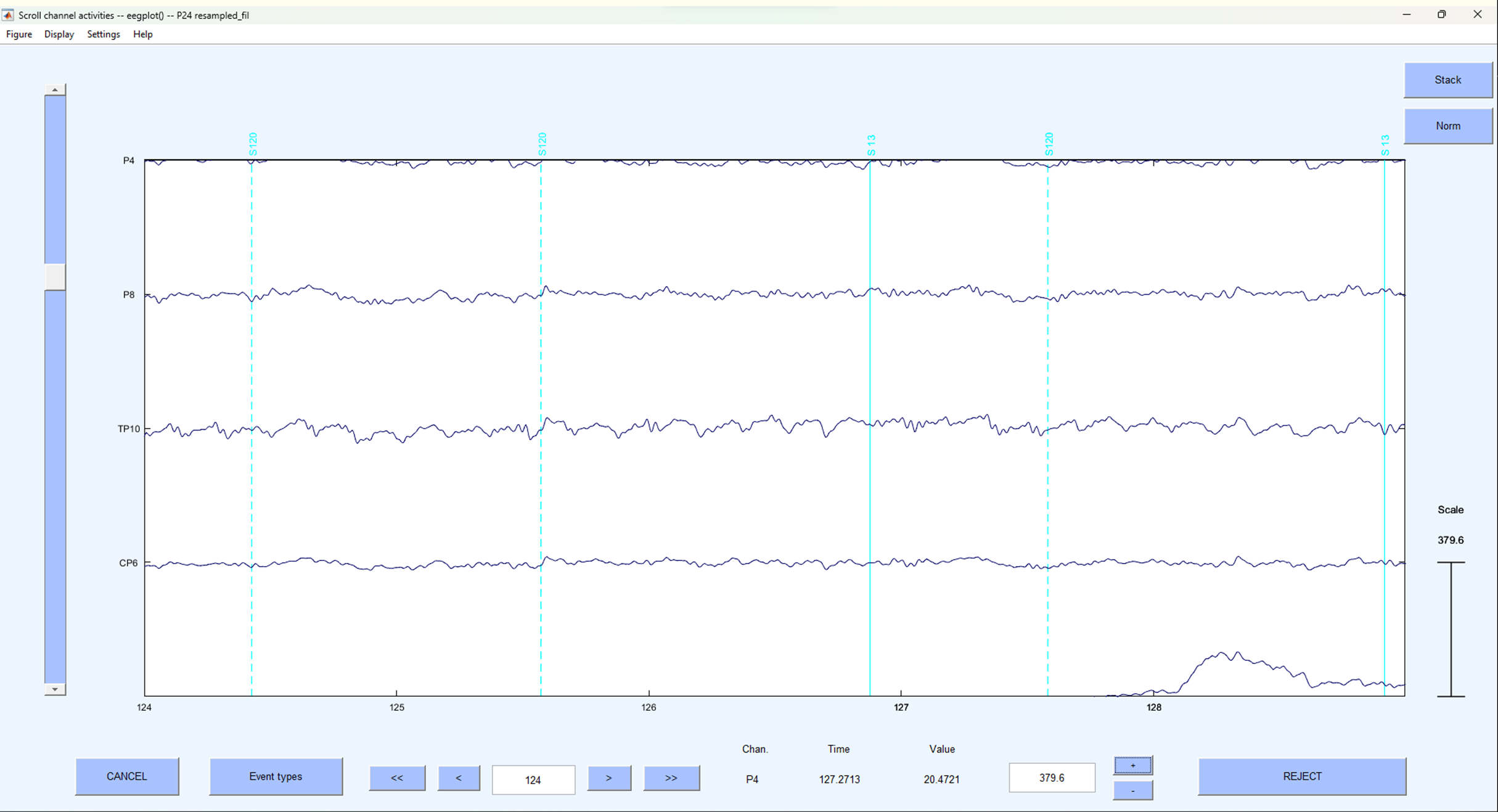
Here - it should now be quite visible, that electrode TP10 is displaying unusual continuous large fluctuations in voltage compared to other electrodes. Let’s interpolate it.
Interpolation
Close the plot window and on the EEGLAB home screen click:
-> Tools
  -> Interpolate electrodes
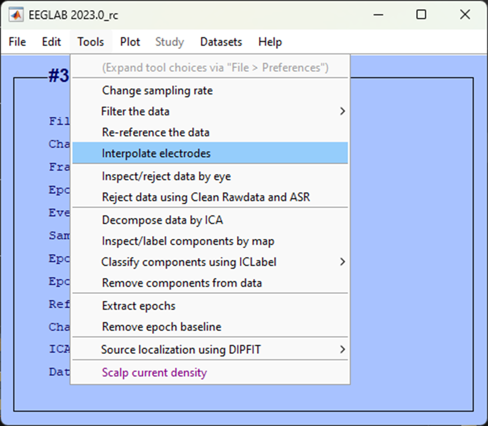
In the resultant pop-up window select Select from data channels

Then, select the electrode you want to interpolate, in this case TP10 and click Ok.
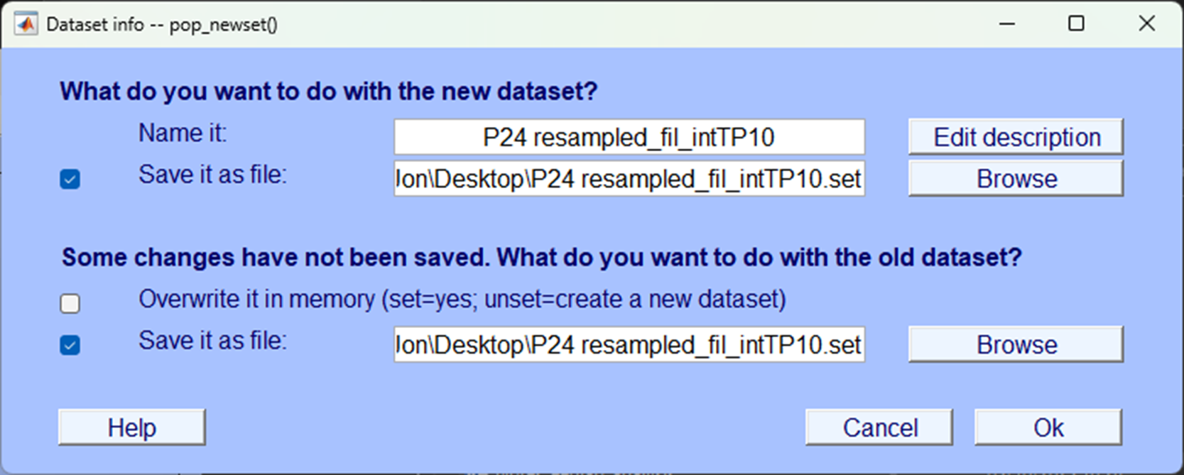
Make sure you save the dataset.
Check the interpolation
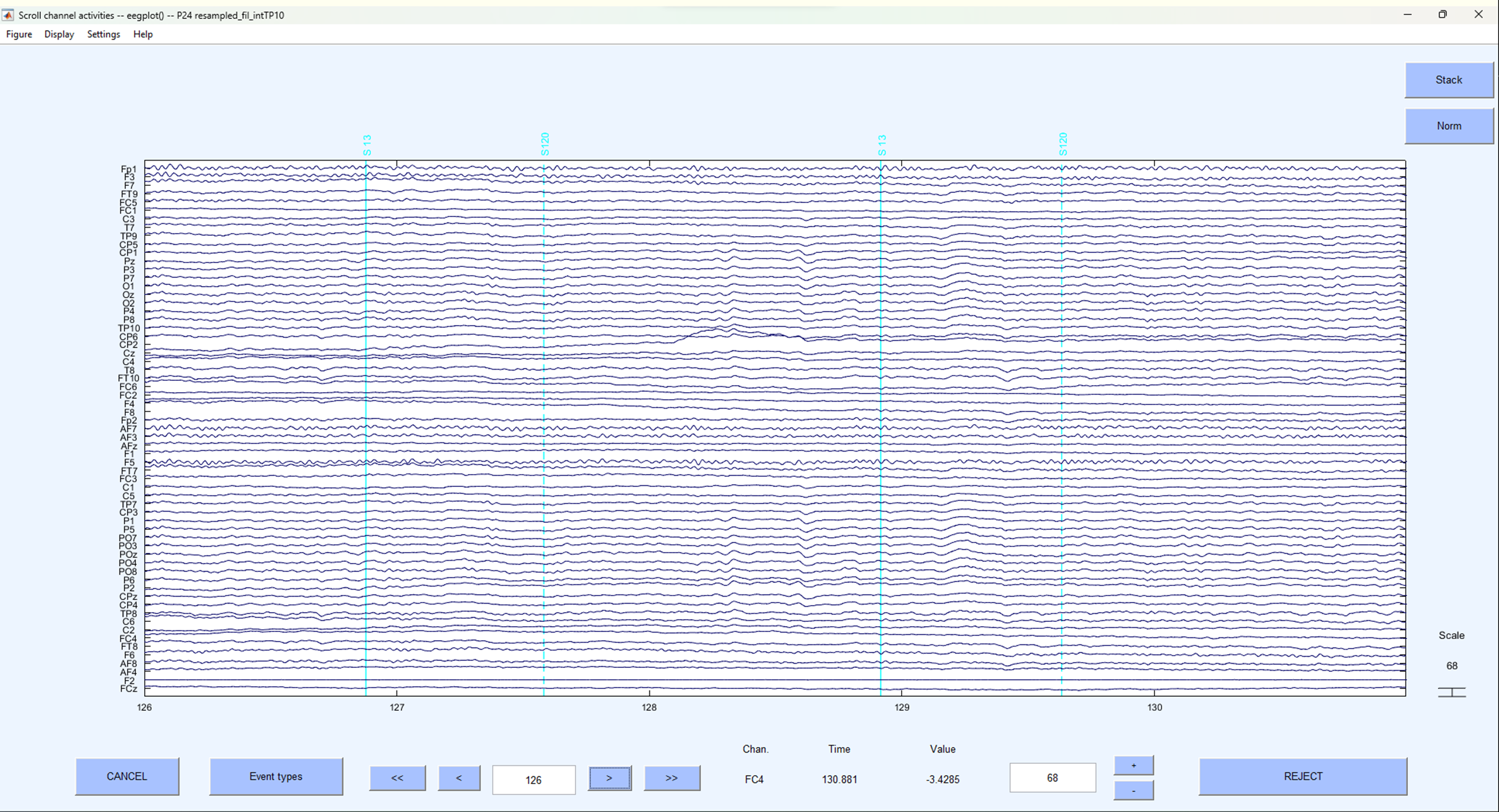
Now you’ve interpolated the channel let’s plot the data as we did before and look at the same time to see what the electrode looks like.
 As you can see
 TP10 now looks far more like the other electrodes around it. Let’s take a closer look:
 Clearly, the artefactual noise that was previously present in the electrode is now no longer visible.
Test yourself
Question 1 | Should you interpolate an electrode with large artefactual fluctuations only present when no triggers are in the data?
Question 2 | Should you interpolate an electrode that shows no voltage fluctuations at all?